The goal of this project was to deliver a logo and basic brand guides for a young professional duo of entrepreneurs diving into the niche but bountiful commercial diving industry.
Deliverables: logo, brand guide, stationery templates
CREATIVE PROCESS
1- Brainstorm
I started by researching the field, looking for identifiers and reoccuring motifs across the diving industry - graphics, colours, mood, etc. What I landed on was a lot of modern scuba masks and every shade of blue imaginable.
The client already had an idea on what colurs it wanted to use, imagery, and professional image.
I pulled together a moodboard and jotted down notes - what I liked and what I wanted to do differently. From this point I got to sketching and getting my ideas down on paper.
2- Ideate
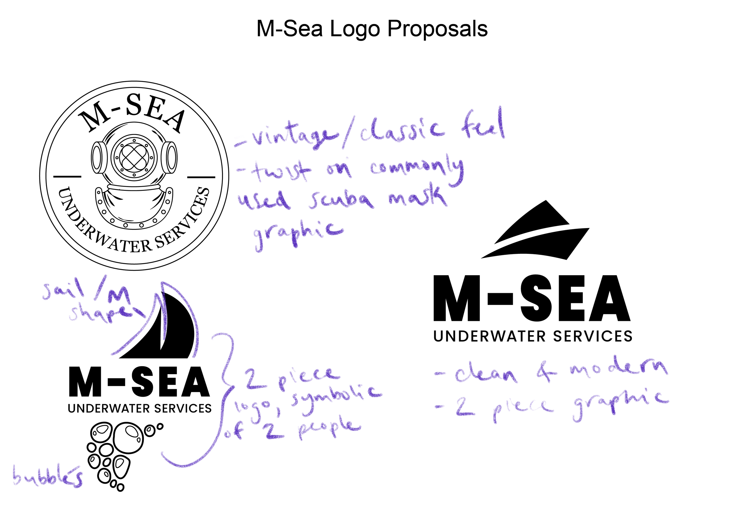
I wanted the logo to be recognisable as being part of the industry but with it’s own unique visual aspect. I liked the traditional aspect of the scuba mask but also the modern and sleek look of abstract shapes.
I worked three main concepts, communicating with the client and getting feedback on which direction we were heading for.
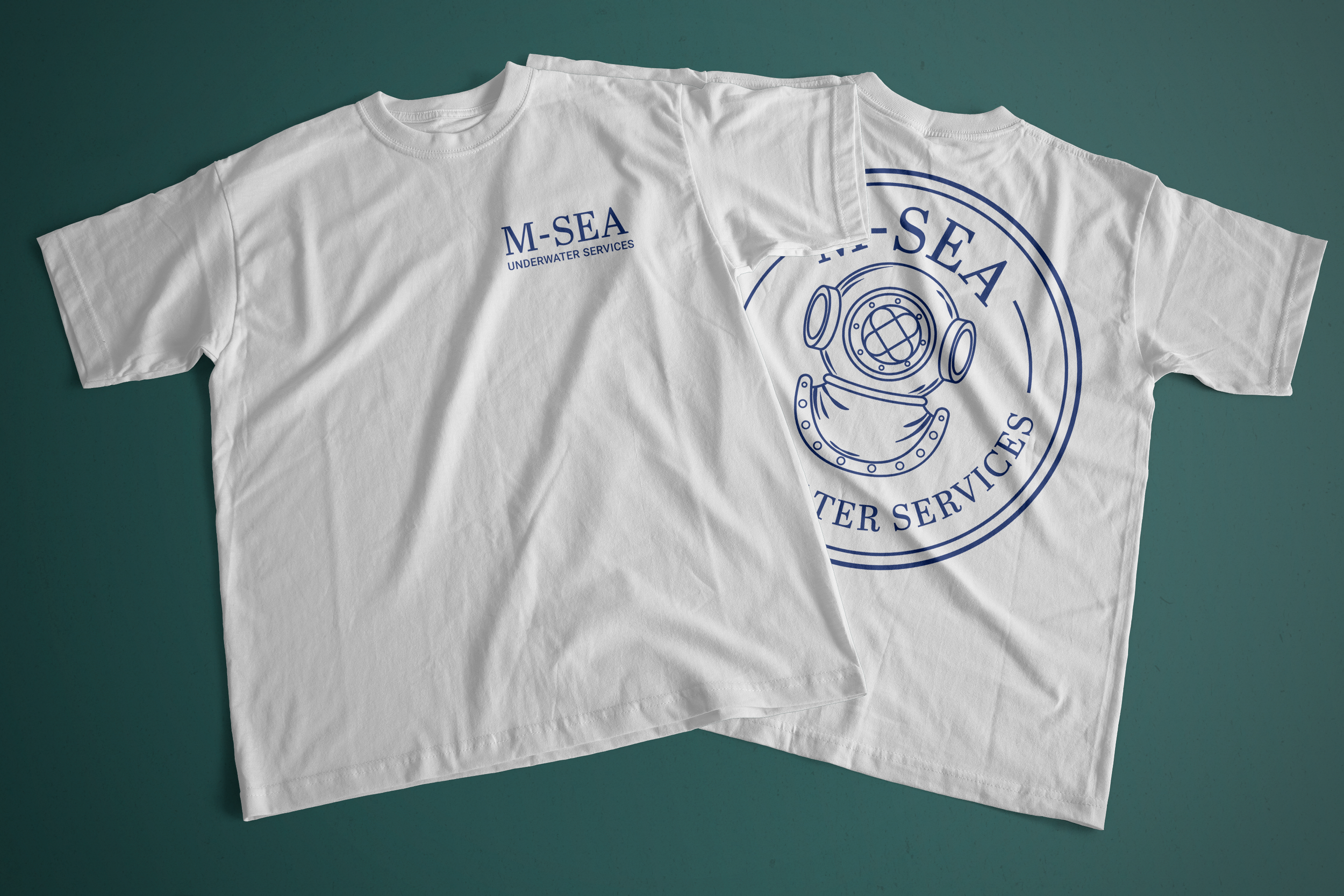
The chosen design has a vintage/heritage feel, giving a sense of wisdom and experience. I wanted to stick with blue as a primary colour for its feelings of reliability and trustworthiness but lean into an energetic colour like the chosen warm yellow, as a sharp contrast and symbol of freshness and youth in the industry.
3- Deliver
The final step was organising the files into separate assets and outlining guidelines for the brand imagery, as the clients were going to outsource and self manage its online presence and web design.
As well as logo assets, I also designed templates for brand business cards, invoices, and quotes.
The main logo graphic was also made into a simplified version for easier recognizability and scaling within different mediums.
Designed for M-Sea Underwater Services


